You may be wondering, should you make your own website?
Perhaps on Squarespace, Wix, Weebly, WordPress, Shopify or any of the other many products that allow you to create your own site?
It really is a fair question.
And the answer is…
It depends!
The pro’s:
- Most platforms are easy enough to learn
- You can put together a website yourself quite cheaply
The cons;
- You have to invest a reasonable amount of time to do a decent job
- The cost of putting your own valuable time into a website instead of working on your business, will likely outweigh the savings in the long run
- If you only run one simple website in your spare time, you don’t build a wealth of experience to draw on when it comes to optimising and troubleshooting
- You need to constantly be learning about websites and stay up to date with changes in technology and the ever changing environment that is the wonderful internet
So if you have a lot of free time, sure it can’t hurt to give it a go. Having any website might be better than nothing at all.
But if you’re a busy business owner, it is probably a good idea to get someone else to do it! Bonus points if you get them to manage it too.
Tips for building your own website:
But what if you really really want to build that site yourself and you have more spare time than spare money?
Go for it! Have fun with it! I think making websites is fun, and I hope you do to. And here’s three important tips:
- Think of what your customers need from your website, and make whatever that is, easy to find. Your phone number? Your location? Your email address? A quote request form? Online store? Online booking? Whatever it is they most need, make it easy to find.
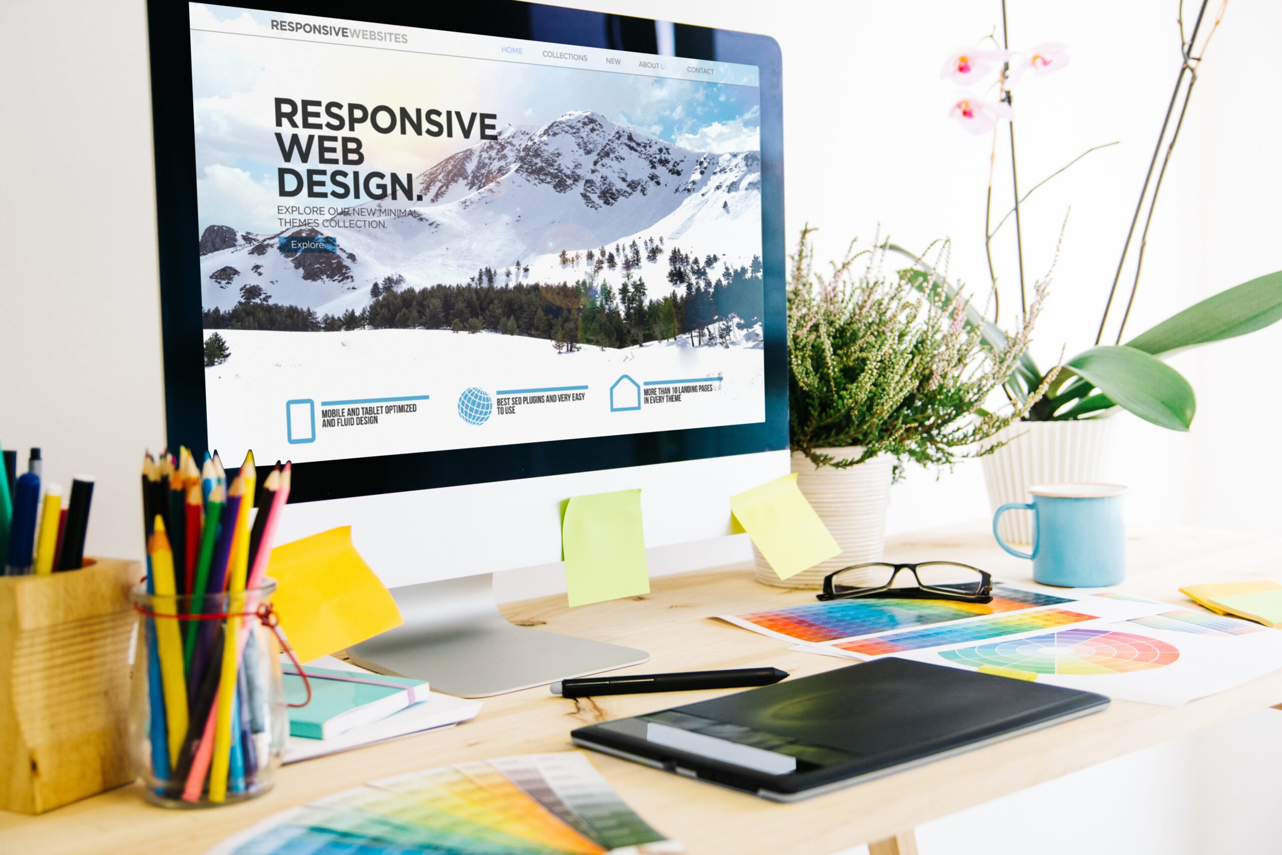
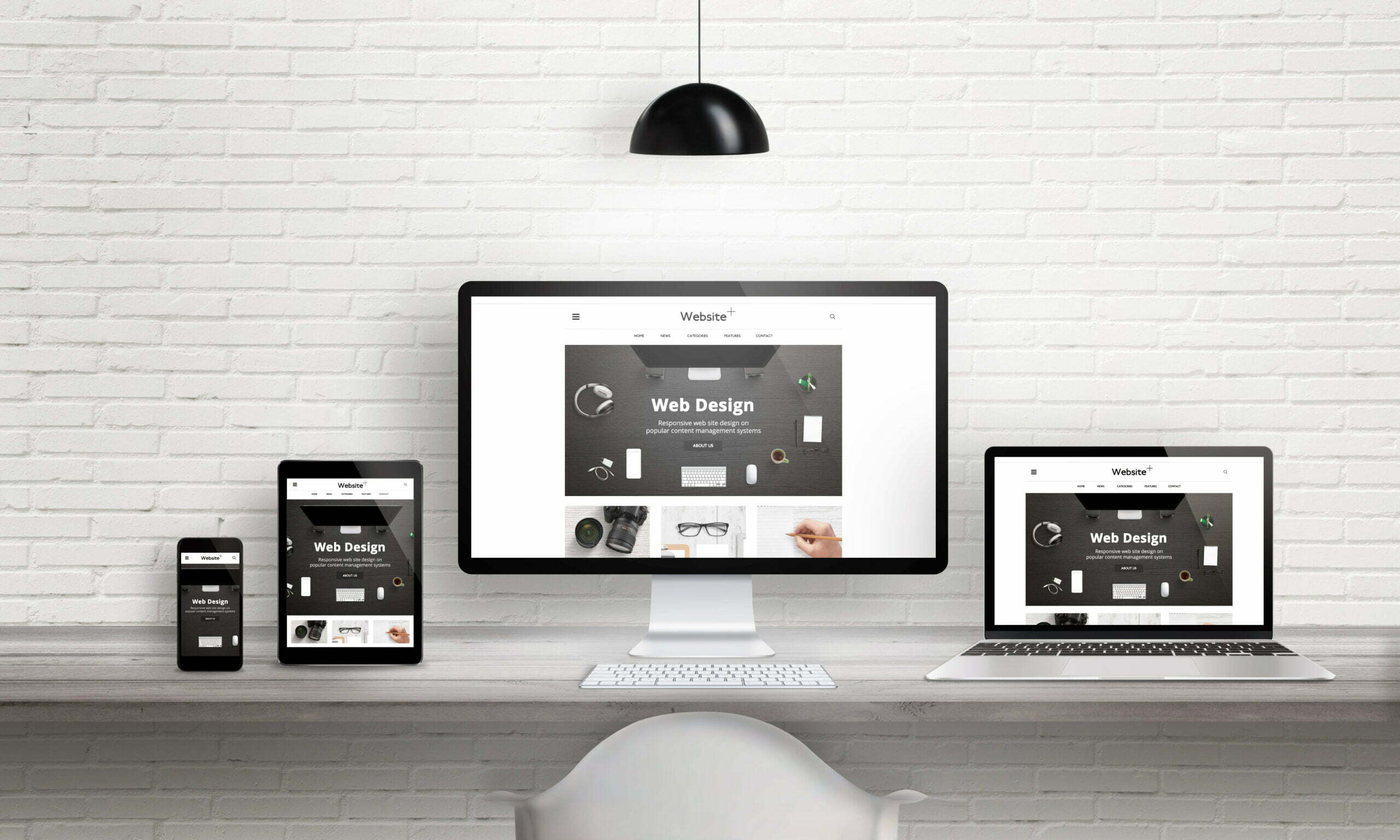
- People visit websites more on mobiles than desktop computers these days, so make sure your site is responsive, and looks great and functions well on multiple kinds of phones, various tablets, laptops, Windows and Mac computers, and all the most popular browsers.
- People and search engines both prefer websites that are human friendly. Keywords are important for being found online by search engines, but you should also make sure your site loads quickly, has great accessibility, and is easy to navigate.
Tips for site design…
You’ll see that my list didn’t say “make sure it looks like the fanciest most artistic website ever”. Thats because spectacular design is nice, but takes a lot of work to get right. Simple is good.
If your customer is trying to get hold of you what they really care about is finding that contact info quickly and easily.
And if your customer wants to buy something from you online, they want that to be quick and easy too.
Making things pretty is lovely, but your customers are coming to your website to achieve a purpose, not to be stunned by your sites design. Keep it simple.
And of course I have to go on to say they don’t want to be put off by your sites looks either, so if you don’t want to spend time learning colour theory, go monochrome with one accent colour.
Go now, you’re all set, have a great adventure!
And if the fun eventually wears thin and running your website becomes just another chore, remember…
Don’t panic… We’re here to help!


